|
|
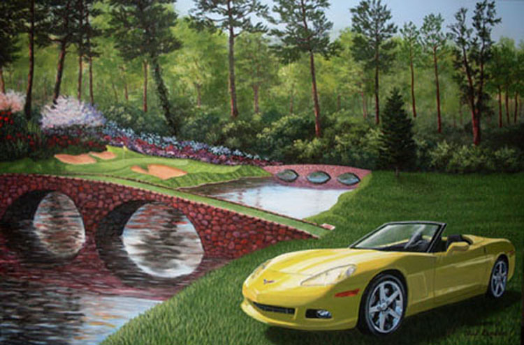
Corvette by 12th
Hole of Augusta Painting
|
| This was a commissioned work done with two photographs and then put together. The originial work was done on a 24"x36" canvas. The customer wanted the persons Corvette (or rather a Corvette like his) to be done on ;the Augusta Golf Course - the 12th hole to be exact. |
|
|
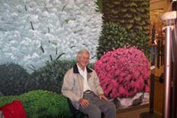
Branson Mill Mural
|
| This mural is painted in the Branson Mill, a place where craftsman, artisians, and and sellers of art and crafts have booths . The customerof this booth wanted a garden scene with all her favorite flowers included. She also wanted it to look like the Ozarks. This is a picture of her husband sitting on a bench in the booth. Notice how he looks like he is in the garden. |
|
|
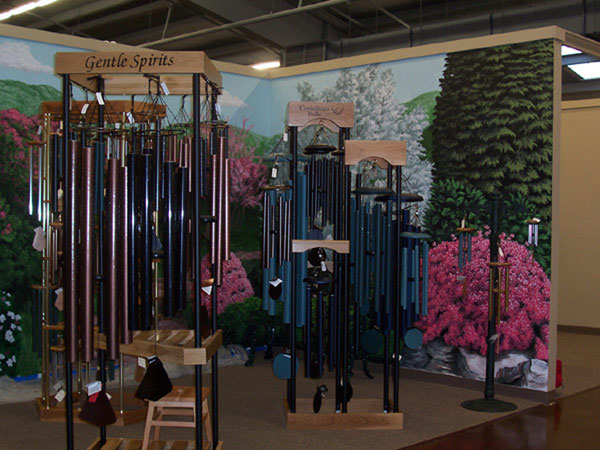
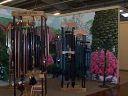
Branson Mill Mural 2
|
| This shows a little more complete view of the mural. The sellers of this booth sold wind chimes at the time the mural was done. |
|
|
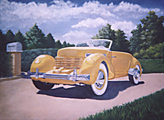
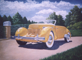
1937 Cord Phaeton
|
| This painting was done as a house warming present for some friends of mine. The husband wanted a 1937 Cord Phaeton. this was the first carpainting I had ever done. I did the yellow Corvette painting later. He wanted it to be yellow and a convertible. The original was a hard top. By looking at several photos I figured at the angle and what it should look like. I used a purple shadow to compliment the yellow car on a grey pavement so the car would stand out. I made the clouds and trees uninteresting, so the focus would be the car. Incidentialy, I added a mailbox as a finishing touch and put the couples name on it. |
|
|
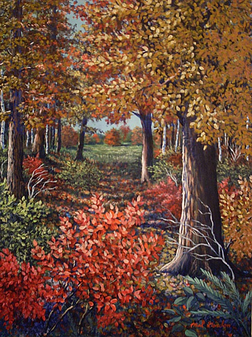
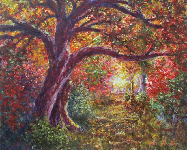
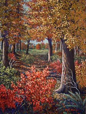
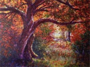
Fall Path Through Trees
|
| This is a stylized painting I did of fall trees. My major emphasis was more on color and light rather than realism. Notice the triangle patterns of trees and bushes and how your eyes are led through the trees to the orange tree in the opening back in the background. |
|
|
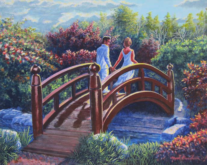
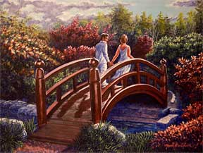
Bridge To Forever
|
| This painting was done using several photos for reference. I kept the foreground fairly dark to get the brilliance on the lighting to come out. I also only used ultramarine blue as my darkest tone so that it would not look so harsh. I tried to get the feel of romance in the painting and innocence of the couple by using white in their clothing, which also brought the figures out against the dark background. I was looking for more of a sunrise effect so I stayed away from putting orange in the sky. I didn't plan it, but if you look closley you can see the number "25" or "23' in the negative space of the bushes. Also you can also make out the word "love" in the clouds. |
|
|
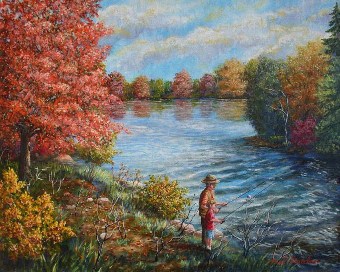
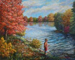
Fishing With Grandpa
|
This painting was started with the idea of painting clouds in an impressionistic manner and evolved to a more realistic peice. Notice how the flow of the clouds leads to the water then to the old man and young boy. I added the figures latter after I finished the trees because it just didn't look finished or interesting enough without them. As one looks around the painting to the trees, clouds, and water, etc. the eye always comes back to the figures eventhough they are clothed in the same fall colors as the trees.
Price: $250.00 plus shipping |
|
|
Light Through Trees
|
| This work was done by inspiration of the Holy Spirit. I drew kind of an idea I had for the main tree in the woods. then I started just putting paint on the canvas . I figured out where I wanted the light source to be, and started laying in white, yellow, orange, red and green. I used dioxazine purple as my shadow color cause it mixed best with my colors, and looked warmer than ultramarine blue. The feel of the painting is very impressionistic and loose whit less detail. To make sure I didn't get too detailed I used a large 3/4 filbert brush to do the painting. |
|

|
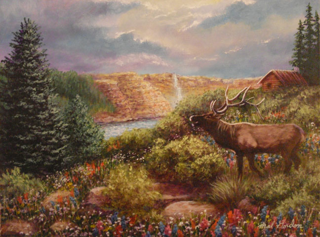
Elk On Mountain
|
| This acrylic painting started out with just putting paint on the canvas and blending without any reference art to look at. It is what I like to call a" Holy Spirit" painting. Normally I have a photo to look at to get the light and feel I am looking for in a painting. In this work the only reference art I used later was the elk and trees to the left. I especially liked the way the clouds came out. This started out as an impressionistic work, but kind of moved to a slightly more realistic painting. |
|
|
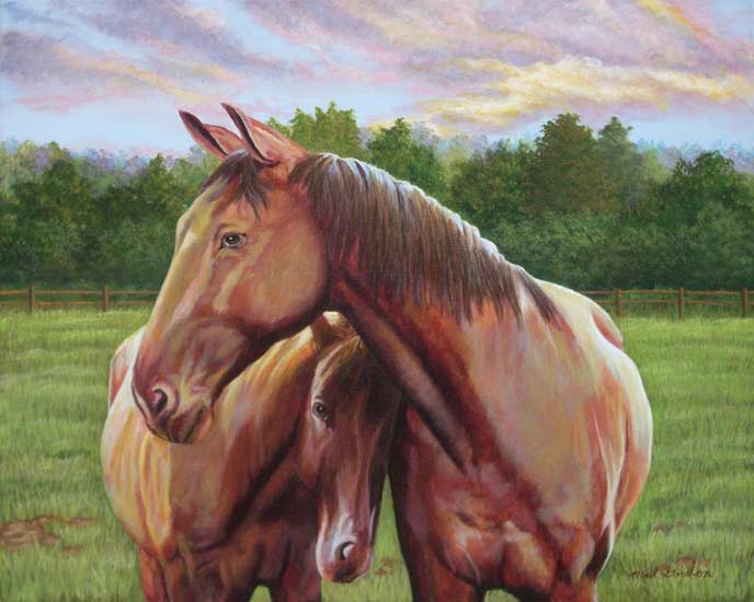
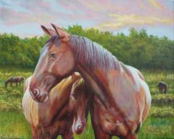
Horse and Colt Together
|
Horse and Colt Together Painting was done from a photo I found on Morguefile.com. I liked the horses position, but decided to change the background and sky to something a little more interesting. I used the same purplish tones in the horses and the clouds with a yellow to compliment the blend.
Price $250.00 plus shipping |
|
|
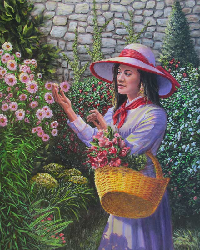
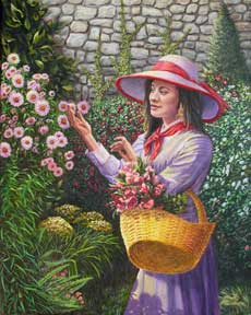
Purple Woman In Garden
|
Purple Woman In Garden painting was done from several photos. I liked the position of the woman, but not the clothes, so I found a style of dress I thought would look good on the figure and added a ha tand scarf to match. I made the basket more yellow to complement the purple of her dress. and the purple flowers she is touching. The red draws the eyes into the the painting and focuses the attention on the figure. |
|

|
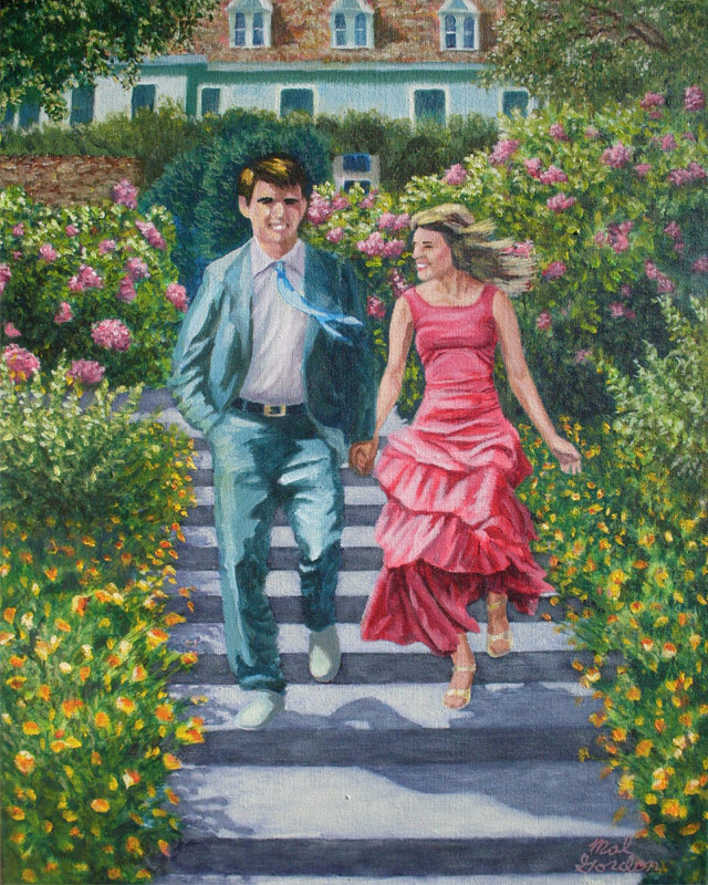
Joyful Journey
|
Joyful Journey painting is a combination of several photos. I wanted to show motion in a impressionistic fashion, while describing through theirsurroundings their possible upper to middle class roots. This couple was not actually together, though you might not know it looking at the unison way they are walking down the steps. You can almost see the wind as you view the tie, jacket and dress all moving to the right.
Price: $250.00 plus shipping |
|
|
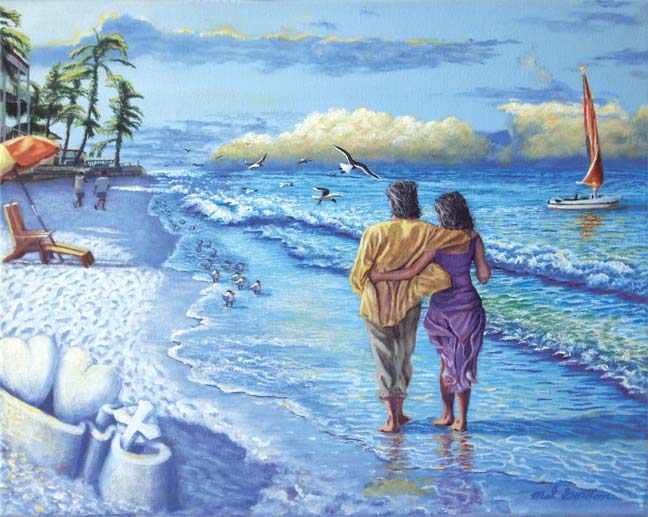
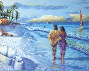
Siesta Keys Beach
|
| Sarasota Dreaming Painting is a combination of several photos I put together for a friend of mine. The couple are painted in complementary colors to show the unity they have with one another. If you look closley at the painting there are images that were not planned-not perfect representations mind you, but still interesting. A girl, Lincoln's and Washington's silhouette, and abstract lion head. |
|
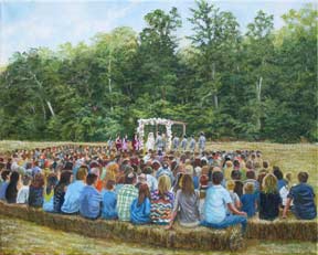 |
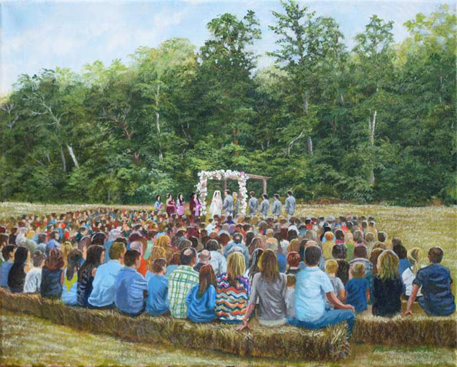
Ozarks Wedding
|
| Ozarks Wedding Painting was done as a commissioned work during a wedding my family and I were invited to. The main concept was indicated during the ceremony then later from a photo the rest was improvised. The challenge was trying to not get too much detail in the figures in the background, putting details in the foreground and still keeping the impressionistic feel. |
|
| |
|